
The quick difference
Walnut is the darker, richer option. Maple is the lighter, cleaner option. Both are hardwoods but they create very different moods. Walnut often feels rugged, classic, outdoorsy, or understated. Maple tends to feel bright, crisp, modern, and high-contrast. When the two are layered together, the contrast makes shapes and inlays stand out before any extra color is added.
Walnut wood patches
Walnut commonly ranges from medium brown to deep chocolate, sometimes with lighter streaks or shifting grain. Engraving darkens the surface, so the artwork can appear subtle and tone-on-tone depending on the specific board and design. That makes walnut a strong fit for wildlife, fishing, American flag, mountain, and other outdoors-inspired artwork.
Choose walnut when you want the patch to blend naturally with black, brown, olive, navy, camo, or earth-tone hats. It has enough visual weight to feel substantial without needing bright color.
Maple wood patches
Maple is naturally pale, usually creamy or lightly golden. Laser engraving creates a darker mark against the light face, giving fine lines and lettering strong visibility. Maple works well for logos, graphic symbols, florals, coastal designs, and artwork where clean contrast is a priority.
Choose maple when you want a lighter focal point on a dark hat or a fresh look on pink, gray, khaki, or lighter cap colors. Natural grain can be quieter than walnut, but it is still visible and still varies from piece to piece.
Using walnut and maple together
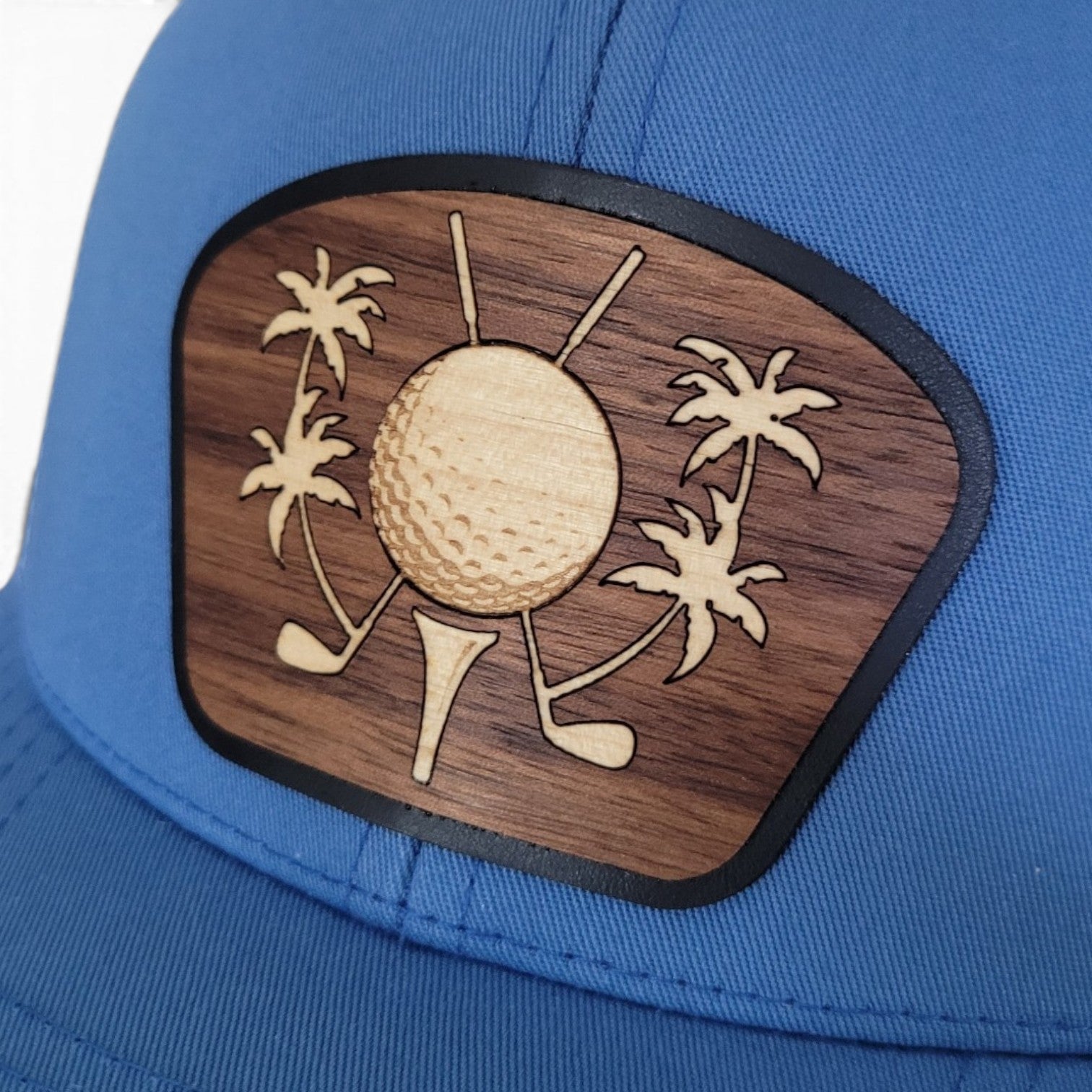
A layered patch lets each wood do a different job. Walnut can provide the background or outer silhouette, while maple creates an inlay, lettering, state shape, or focal icon. The Palm Tee and Stars & Stripes - Florida Edition demonstrate how contrasting hardwoods can build depth without relying on printed ink. The result feels dimensional because it is dimensional.
Which wood shows engraving better?
Maple creates stronger light-to-dark contrast. Walnut can produce a more restrained, integrated engraving. Neither is automatically better. A bold logo may look excellent on either; delicate line art may benefit from maple; and a rustic design may feel more natural on walnut. Grain, board color, line thickness, and the laser settings all affect the result.
Which should you choose for a custom logo?
Start with the logo's visual needs. If the mark relies on thin lettering or fine lines, maple may provide more immediate contrast. If it uses bold shapes and the brand palette leans earthy or premium, walnut may be a natural match. For a logo with a clear icon and background relationship, a layered walnut-and-maple patch may create the strongest result. A proof or material recommendation is valuable because the best choice is based on the actual artwork, not a universal rule.
Frequently asked questions
Will every walnut or maple patch match? No. Natural tone and grain vary within each species.
Can the patch get wet? Yes, rain is completely fine, but it should not be soaked. Hand-wash the hat carefully.
Can both woods be used in one design? Yes. Layering or inlaying contrasting woods can add definition and depth. Depending on the design or logo we can also incorporate other woods, such as Mahogany, Cherry, and Oak.
Continue exploring our handcrafted designs:
Ready to find a hat cut from a different grain? Shop wooden patch hats or browse the featured designs above.
Share:
Florida-Inspired Gifts Made from Real Hardwood
Unique Gifts for Fishermen, Golfers and Outdoor Lovers